You’re studying in the Masters program at Moholy-Nagy University of Art and Design Budapest …
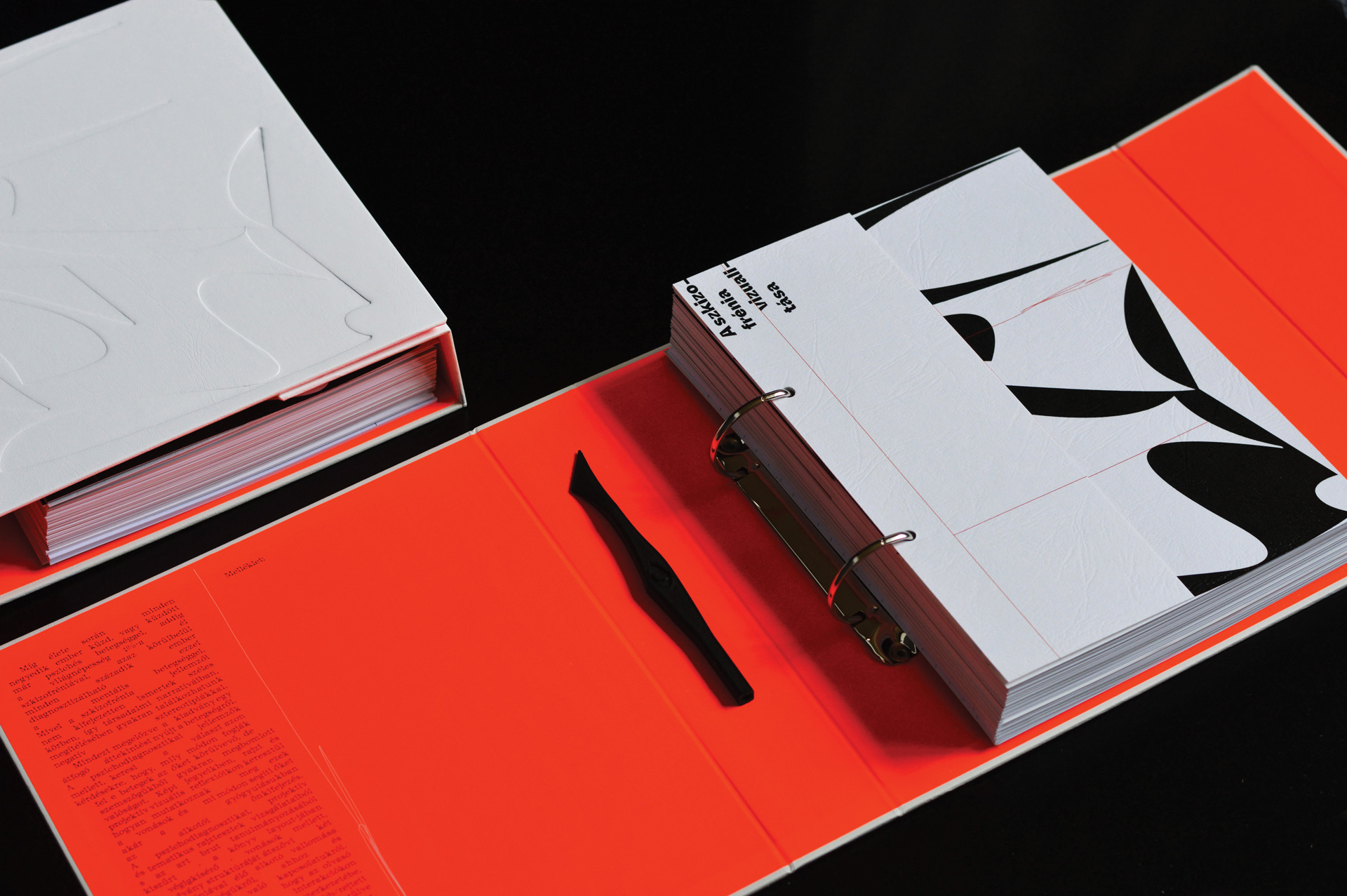
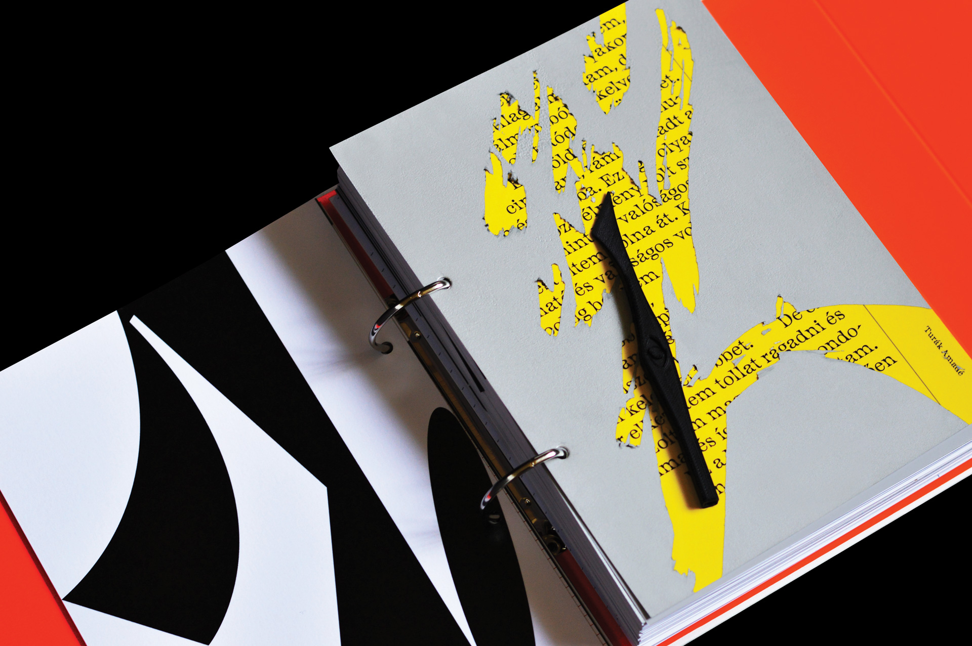
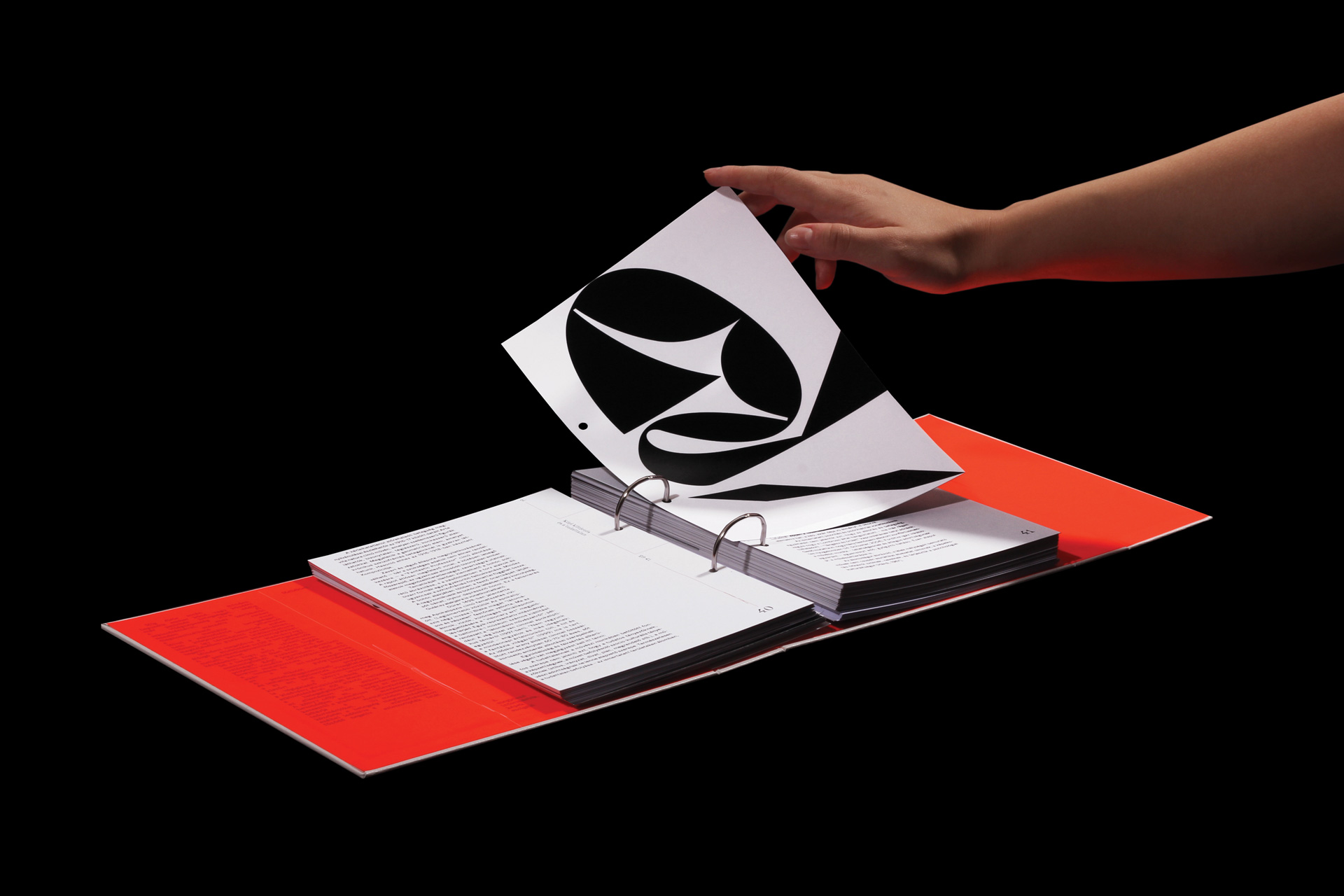
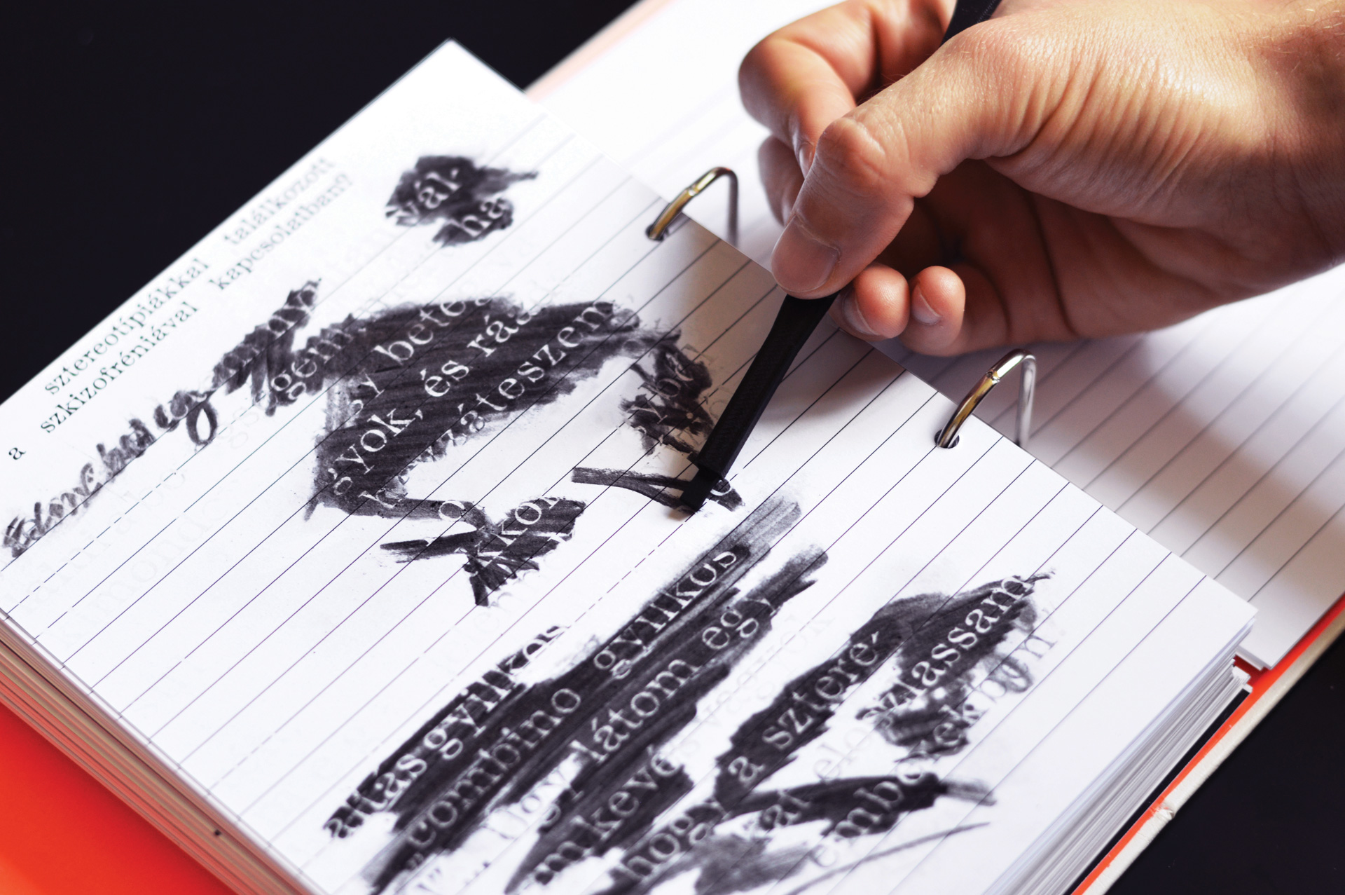
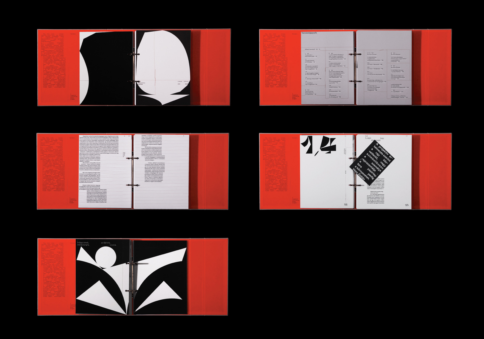
[AC] Yes, I’m currently working on my thesis and researched psychodiagnostic characteristics and behaviors of schizophrenic patients, which I’m translating into visual rules for the design of a book.
Are those rules something that you use often in your design process?
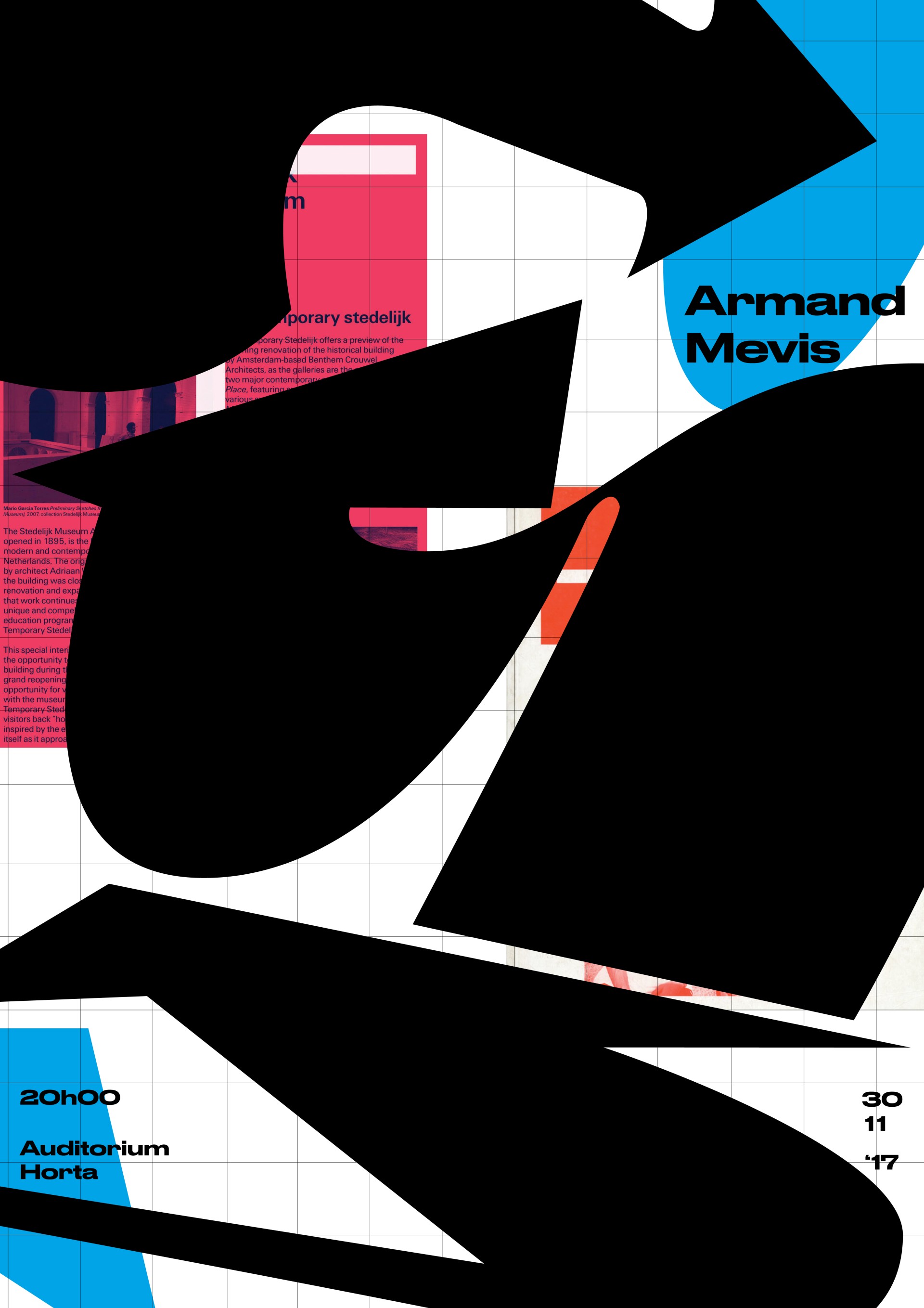
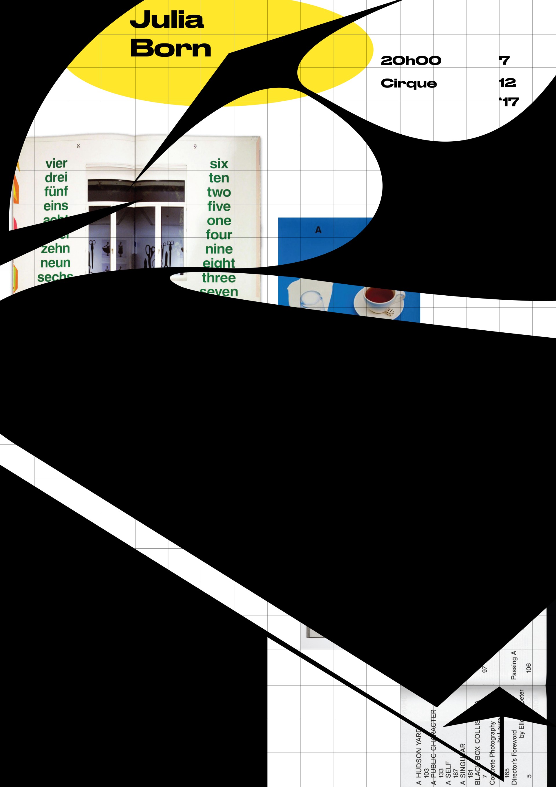
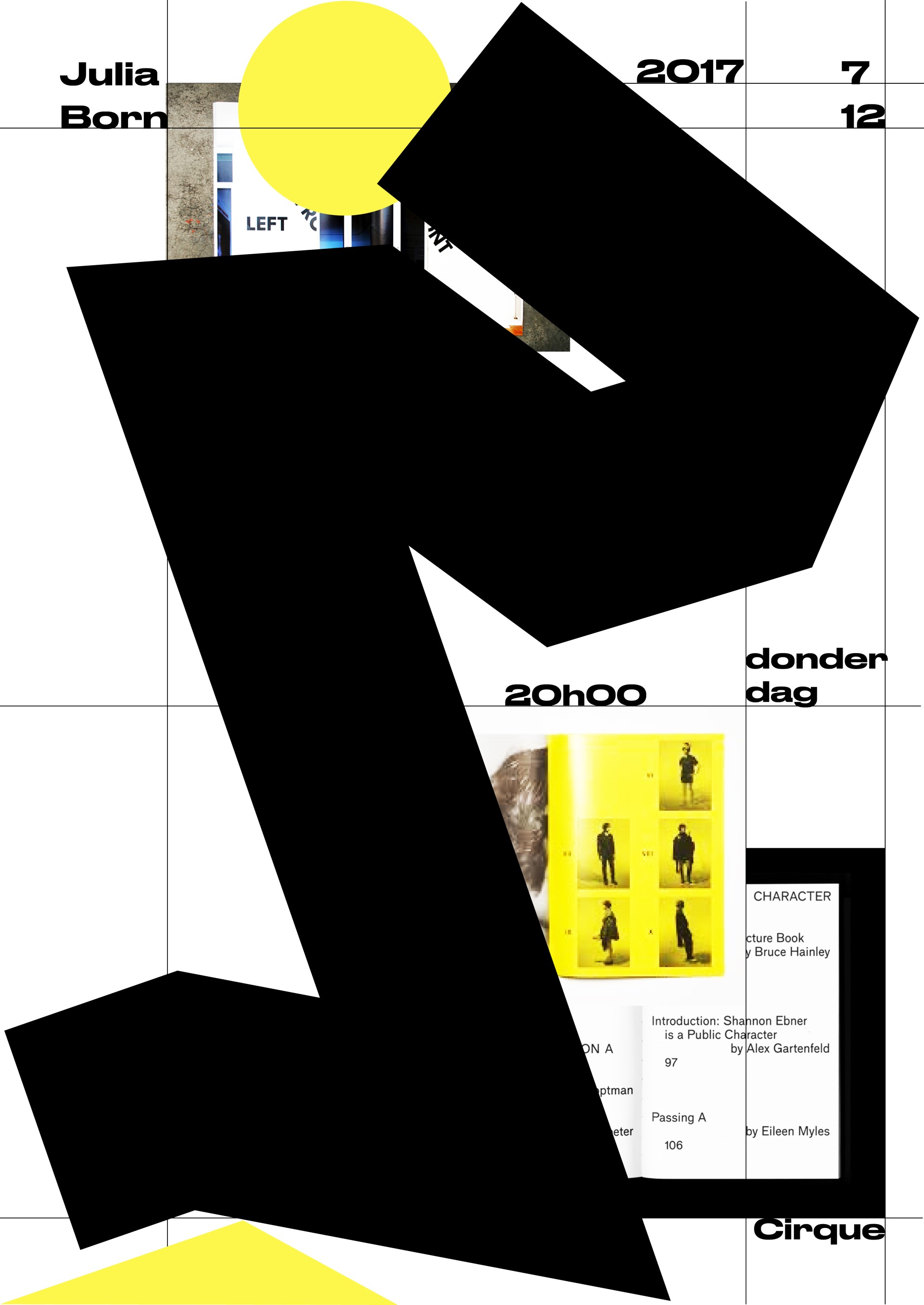
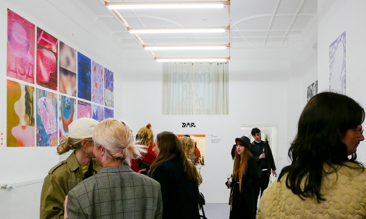
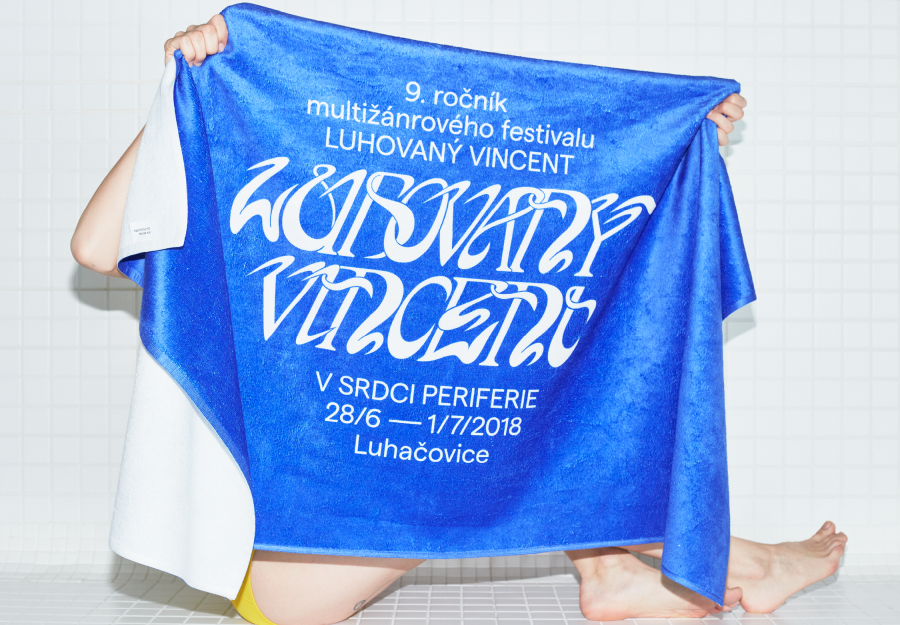
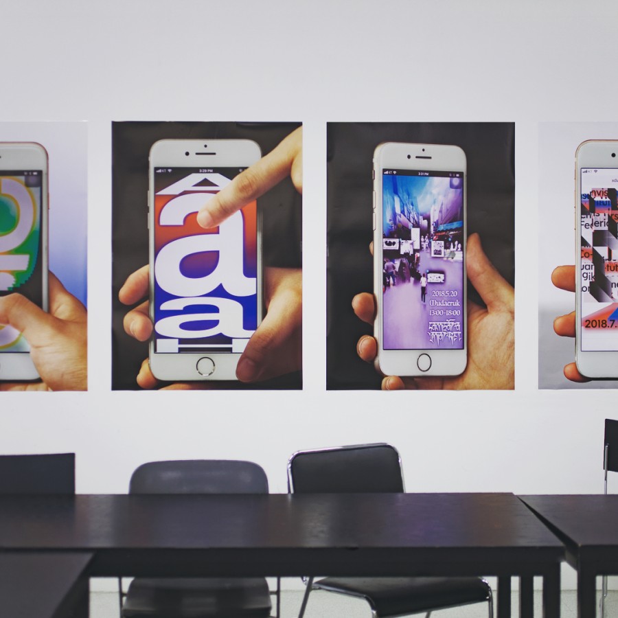
[AC] I do. First, I usually make strict rules and a strict layout and concept coherent with the message I want to convey. After that, I incorporate spontaneous forms—I really like to use twisted letter forms or type experiments for example. The challenge is to find a balance between those strict rules and the chaotic visuals. You can see it in the lecture posters for Julia Born’s lectures with the big arrows. I used the GoogleMaps grid, but the arrows, which are showing the way, are very excessive.
How did you become interested in letter forms?
[AC] A type design workshop with Adam Katyi. That was the first time I used letter forms like tools. From that point on, I started to follow typographers like Erik Spiekermann, Radim Pesko and Paula Scher, as well as younger designers like Charlotte Rohde and the Hungarian designer Dora Balla.
»I think that, in painting, the materials are more closely connected than in a digitally illustrated visual.«
Next to your typographic work, you’ve frequently turned to painting. Why has that become such an important medium for you?
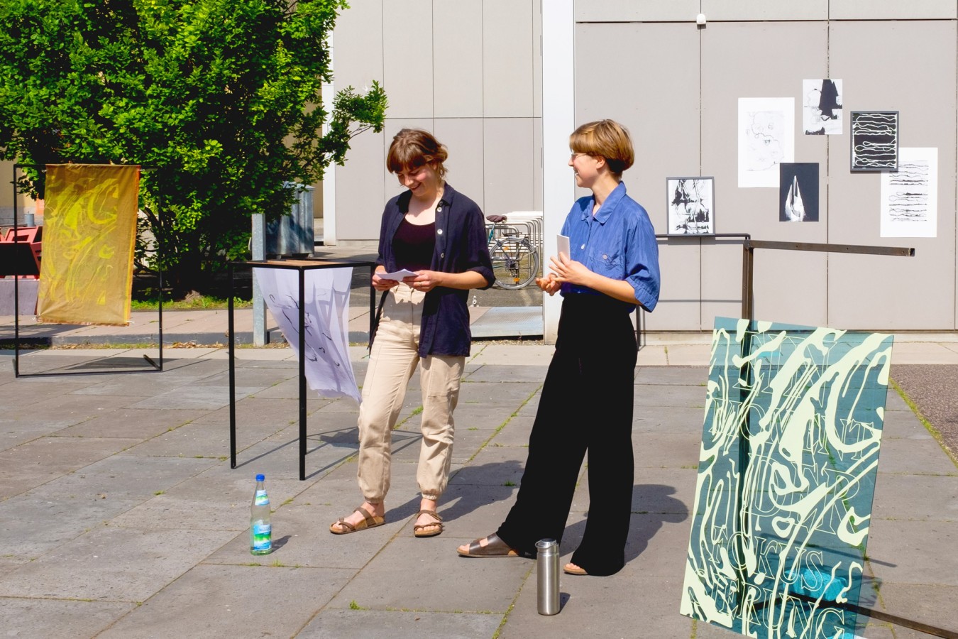
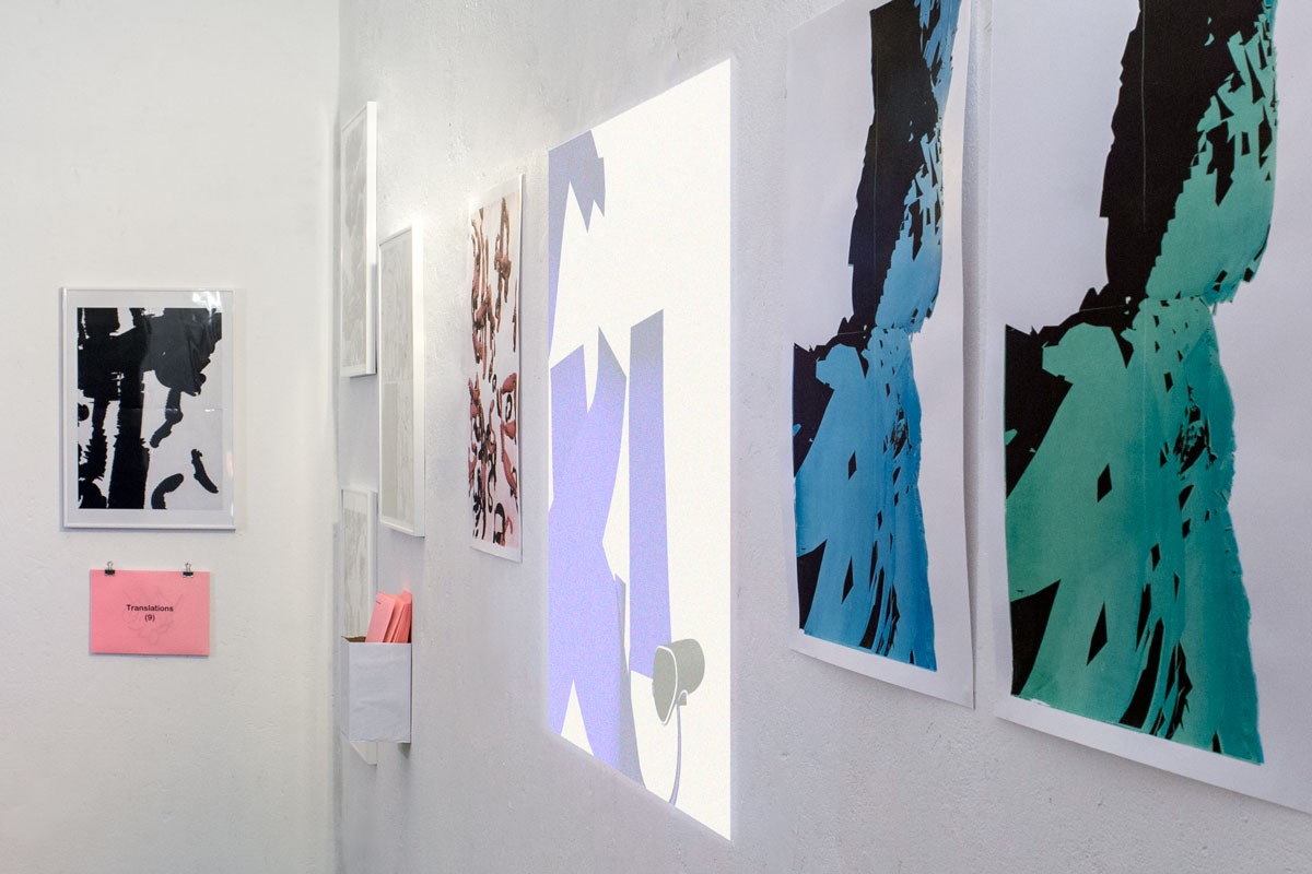
[AC] I started to learn painting from a cubist painter at the age of 14. Every week for six years, I went to his workshop near my hometown. I was really impressed by him. He taught me how to use materials and fabrics, tools and forms. When I design graphics, I usually work digitally from beginning to end. When I paint, I use analogue materials exclusively. I think that in painting the materials, concept and shapes are more closely connected than in a digitally illustrated visual. I use similar forms in graphic design, just the way to create is different ·
These images were not part of the interview’s original version and were added at a later point.


