Having worked as an intern in Porto and Vienna, what did you discover were the differences between those places?
[BR] I would say the scene in Porto is sort of unfazed regarding the design scene in general. And I really liked that they weren’t stressed. When I came to the studio on my first day, they said, “Bára, you arrived at a bad time, because we have a lot of jobs and we’re super stressed right now.” … We met at 11 in the morning, and everyone took a coffee first! The Vienna internship on the other hand was very intense, because I was a full-time intern. I was really working hard for them—and on my own projects after work. That experience made me realize what it really means to be a professional graphic designer …
As of now, you’re back in Brno working on your master thesis. Do you have an idea what’s next?
[BR] I will finish this year and figure out what to do with my life after school. I’m thinking about founding my own business, so that I can generate a basic income, to avoid relying exclusively on the client. Right now, I’m working on my own T-shirt brand, which will launch soon …
»I’ve always had a connection to textiles. Whenever I get the chance, I try to connect the medium with my work.«
Speaking of T-shirts—you often use textiles as a medium, for projects like Luhovaný Vincent festival, the experimental ballet show from Ballet NdB, Lustr festival …
[BR] I’ve always had a connection to textiles, since my mom used to sew my clothes when I was a child. Curiously, this year was all about textiles for me—I learned how to sew and I got an embroidering machine. Whenever I get the chance, I try to connect the medium with my work. Though, I only use it for client work if it makes sense!
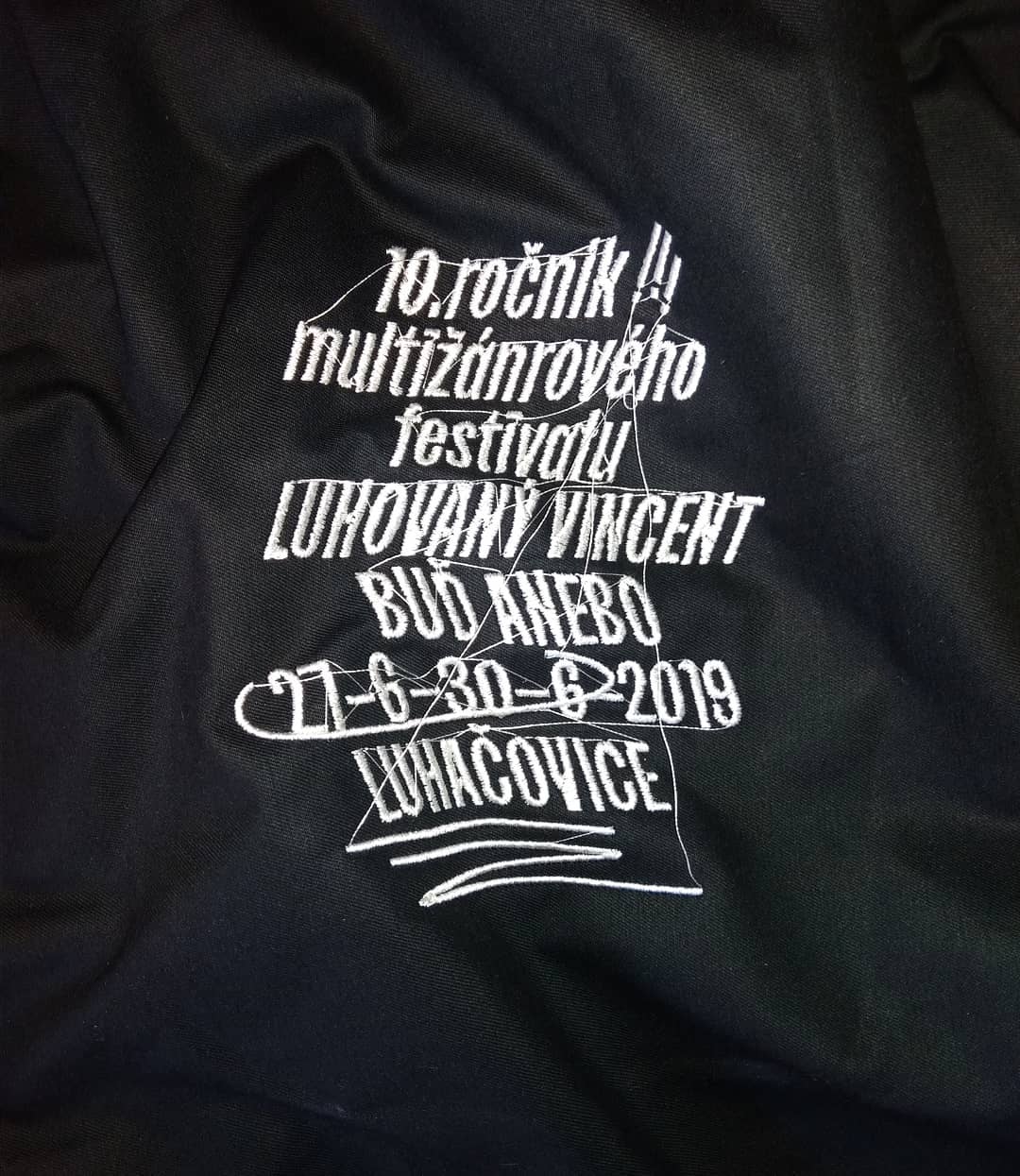
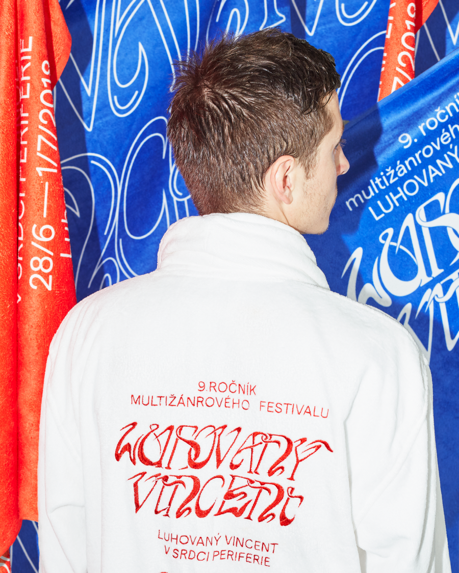
Like the embroidered bathrobes for the Luhovaný Vincent posters?
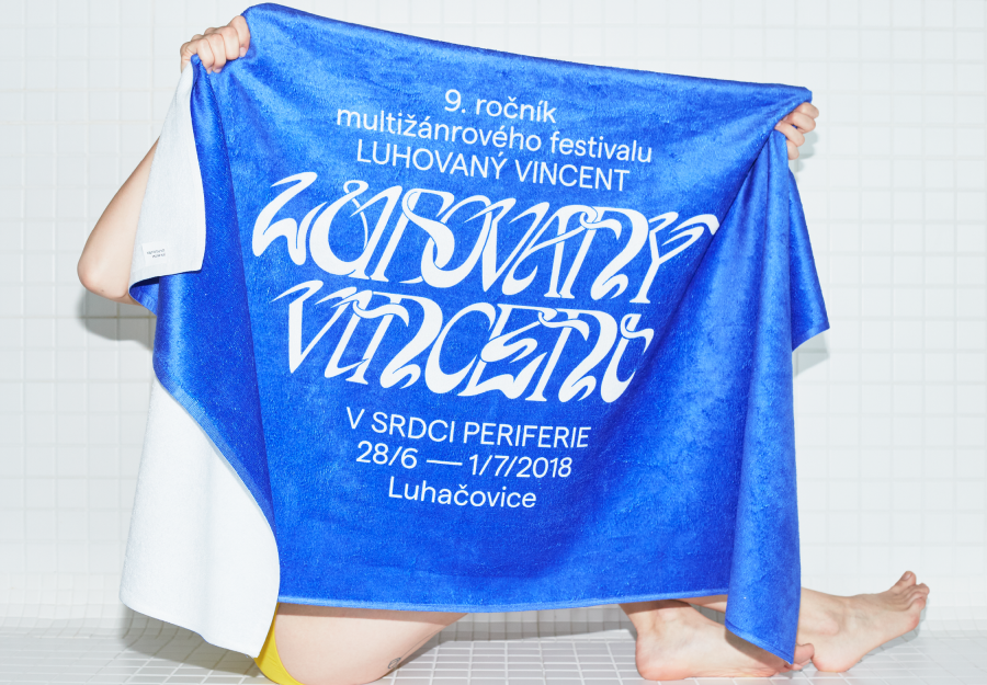
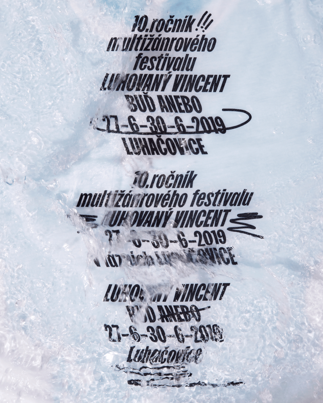
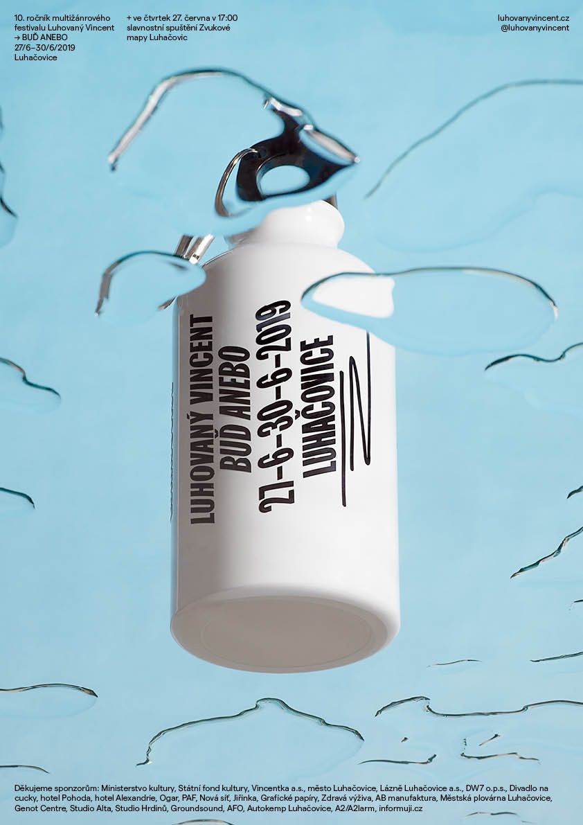
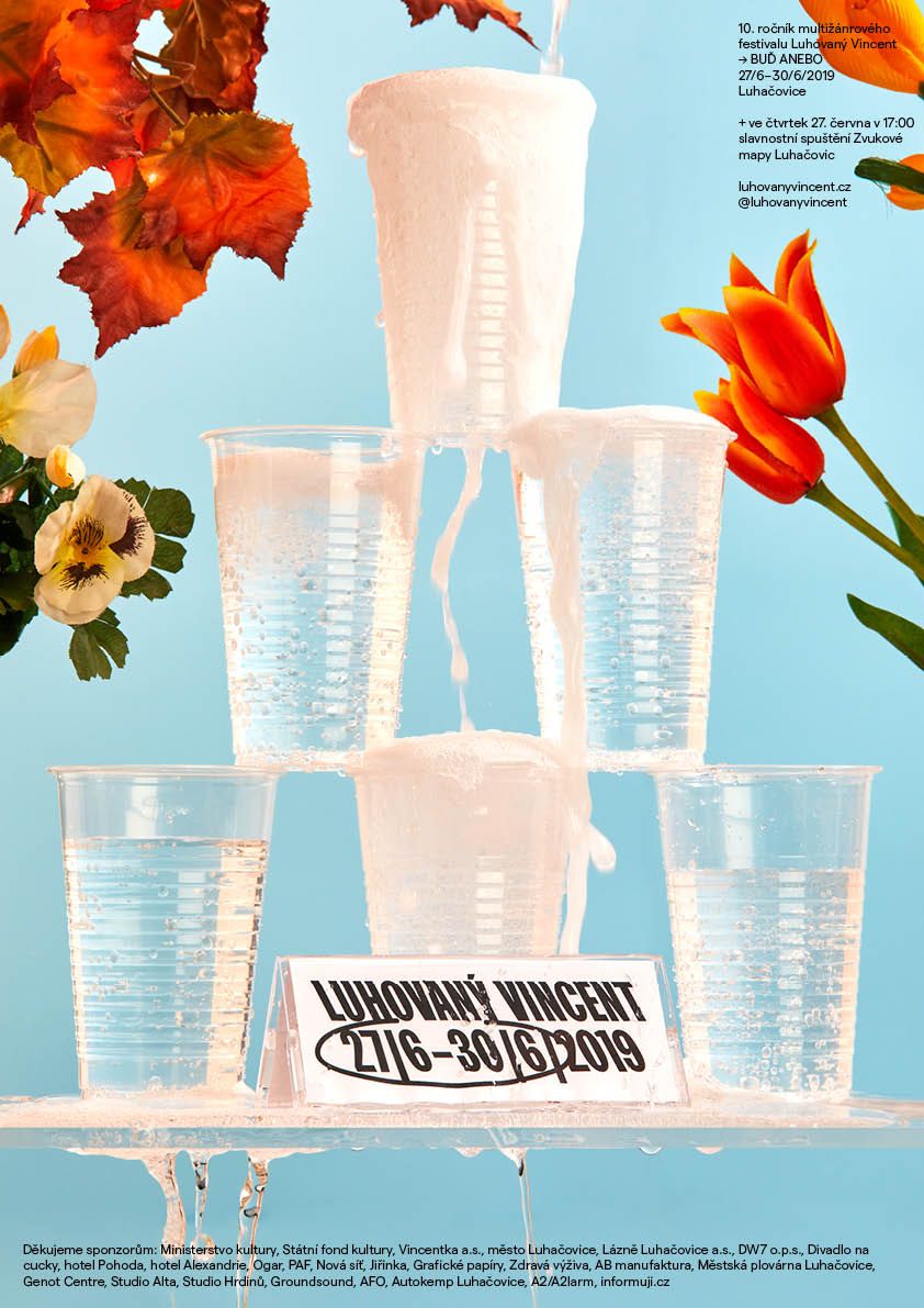
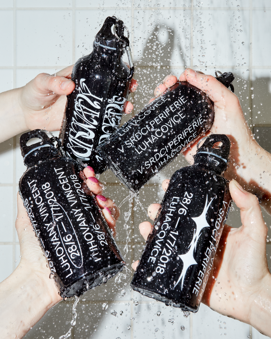
[BR] For the festival the connection was perfect, because it’s a culture festival in the small spa town Luhačovice in the Czech Republic. I made a fashion collection out of the bathrobes and towels and then Filip Beránek took the photos that worked as the posters, with no additional typography.
The identity’s typography comes alive by the photography …
[BR] All the information is printed or sewn and then photographed. This way, each poster looks different, and the system stays flexible and exciting to work with. It was designed to be used consistently for a few years ·
