In an interview with It’s Nice That, you explained that interaction design is all about defining the rules but the results are unexpected and fluid. What does that mean for you in practice?
[YS] I feel that the way I think about graphic design is a bit different from other web designers. At the starting point, I’m not thinking about the final visual form. Rather, I think about a movement or a function. For example you mouse-over a button on a website and it changes shape. First, I find rules that I can tell the computer, like how to use a specific technology, such as screen capture or a webcam, or to change a button statement. Then I collect those functions and compose them and they will make shapes on their own.
»Accessibility is very important when you’re making a poster, because it is made to be distributed to people.«
From a traditional point of view, the way you define your work really pushes the definition of the different media quite far. You blend categories and find overlays and intersections. Is that something that drives your motivation, questioning the limits of those categories?
[YS] I’m interested in approaching graphic design via different media and vice versa. A poster can be an installation and an interactive poster can be a website at the same time. That makes the characteristic of my work. I think there are a lot of methods how to approach graphic design, not just using the printed matter. I think that printed matter is really important, however using diverse media widens my perspective. And that’s what I aim for.
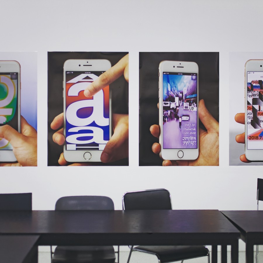
Such as the Tangible Posters …
[YS] I know how to make a mobile site and I can make a static printed poster. It’s a natural process that I make these connections. I love the mobile tangible posters because they’re accessible to everyone out there via just a link, whereas an Augmented Reality poster has to be downloaded to an app and that’s way too complex. Accessibility is very important when you’re making a poster, because it is made to be distributed to people!
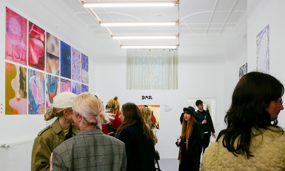
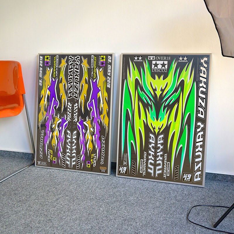
You had the tangible posters printed for an exhibition held at Osaka University. What was the concept of having them be displayed in the traditional sense of the medium?
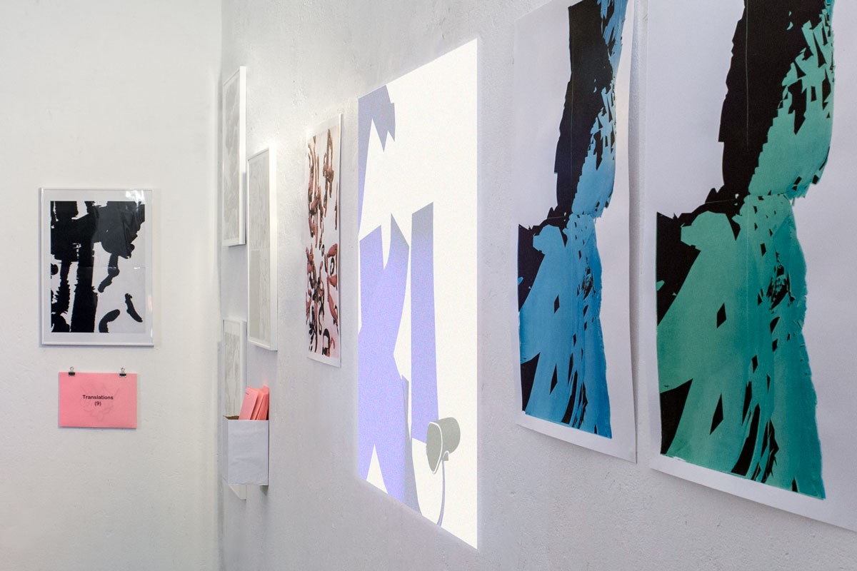
[YS] It was a spontaneous idea to have them printed, but it was really interesting to see the differences in the texture. The process wasn’t an easy one: They were made using the computer, so it’s a code that makes the image. I had to regenerate the code and photoshop it to make them not pixelated—it doesn’t work just as a screen capture. It was way more work than I had thought and I frequently asked myself: Why am I doing this? [laughs]
In some of your works, like the Anti User Friendly series, you take critical standpoints on how people are using technology …
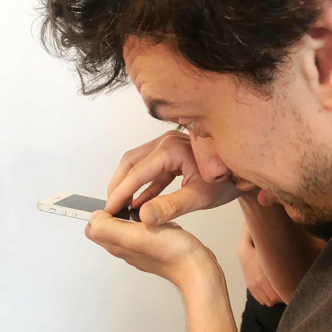
[YS] When we think about technology it’s based on fast and easy use and based on the technology itself. When we think about graphic design we think about how people see the poster or the animation and we think about how to build the installation, because people will stand there and look at it. The Anti User Friendly series is about that can I change the way how people interact with a device and focus more on the human when using technology ·
