
You frequently work with abstract shapes that appear to have no specific historical visual reference. What’s your process behind them?
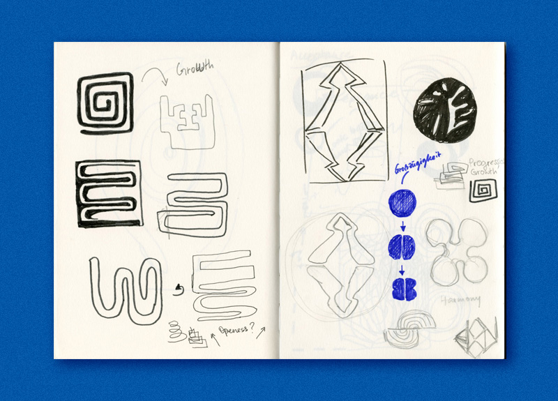
[LB] I sketch and develop these in what I call primitive sessions, a way for me to get off the computer screen and keep in touch with the tangible world. They’re about shutting off from what usually distracts me and creating failures that will serve me as inspiration for future work. Most shapes are intuitive, I follow my feeling and put it to paper. Another influence for me is Henri Matisse, I’m very drawn to his work. However, inspiration can come from the most simple random things of daily life. (Editor’s note: Louise documents her exquisite findings in the mundane on her Instagram.)
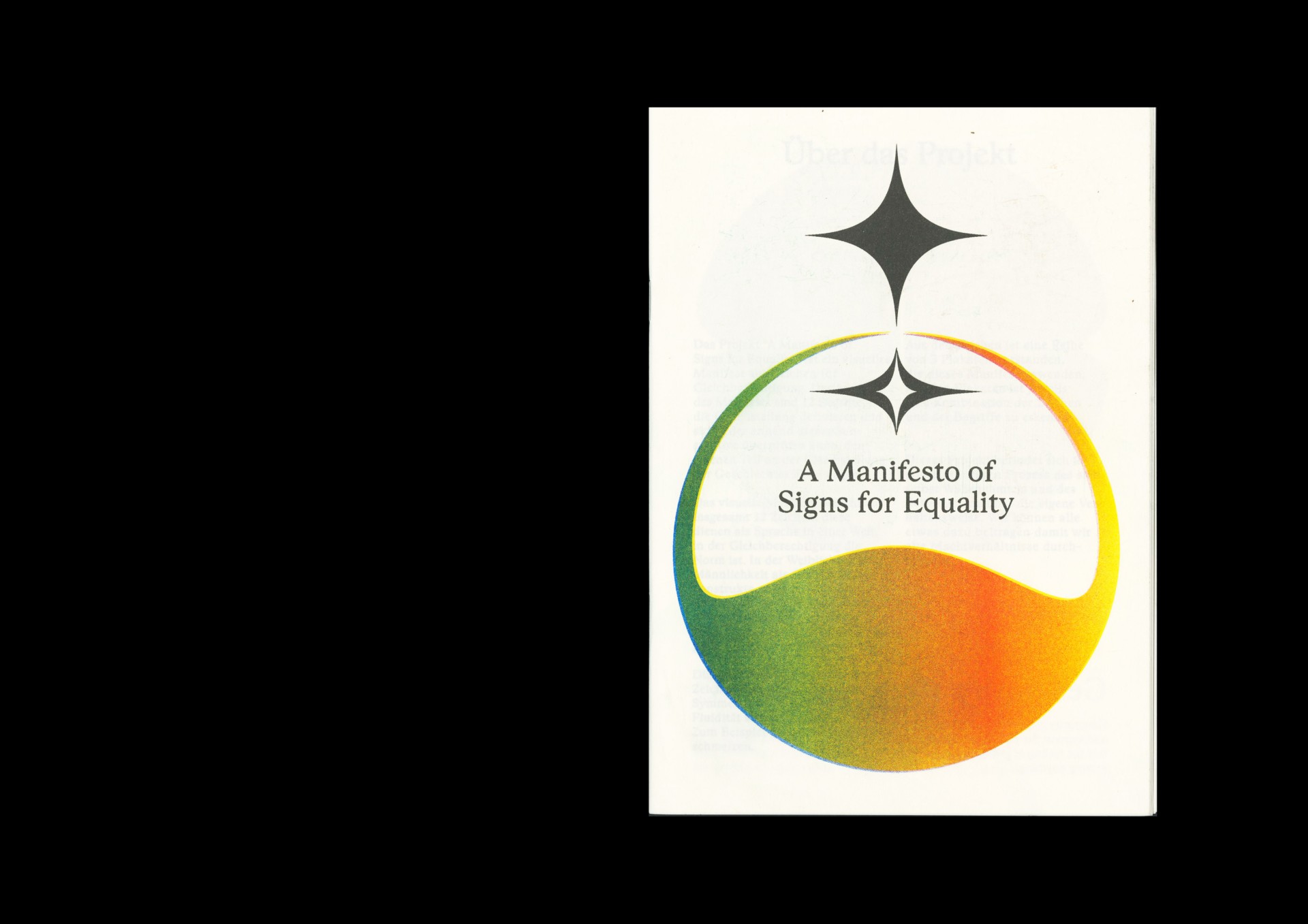
Was there a particular moment that sparked your idea concerning working on issues around gender equality for your Bachelor thesis A Manifesto of Signs for Equality?
[LB] A year ago, I interned at a graphic studio in Amsterdam. I noticed that—from time to time—I was the only woman among the eight designers working there. That was unexpected. Up until that point, my impression was that visual communication is an equal field, as I went to University with many fellow female students and female professors. My personal experience taught me that this is not the case in the industry, and that there is in fact a big imbalance. Returning to University from Amsterdam, I knew I wanted my final project to deal with equality.
What was your approach to such a big task with regards to the topic?
[LB] When I started writing the thesis it was quiet difficult to find books about equality in visual communication. A major resource was the book Women in Graphic Design by Gerda Breuer and Julia Meer. I devoured this book—besides its great interviews and history lessons, it was very valuable to discover that I wasn’t not the only person who thought something wasn’t right. Other projects like Not a Muse encouraged me to become part of the movement and make my own contribution to the conversation.
»Spoken language can be very limiting, especially regarding gender.«
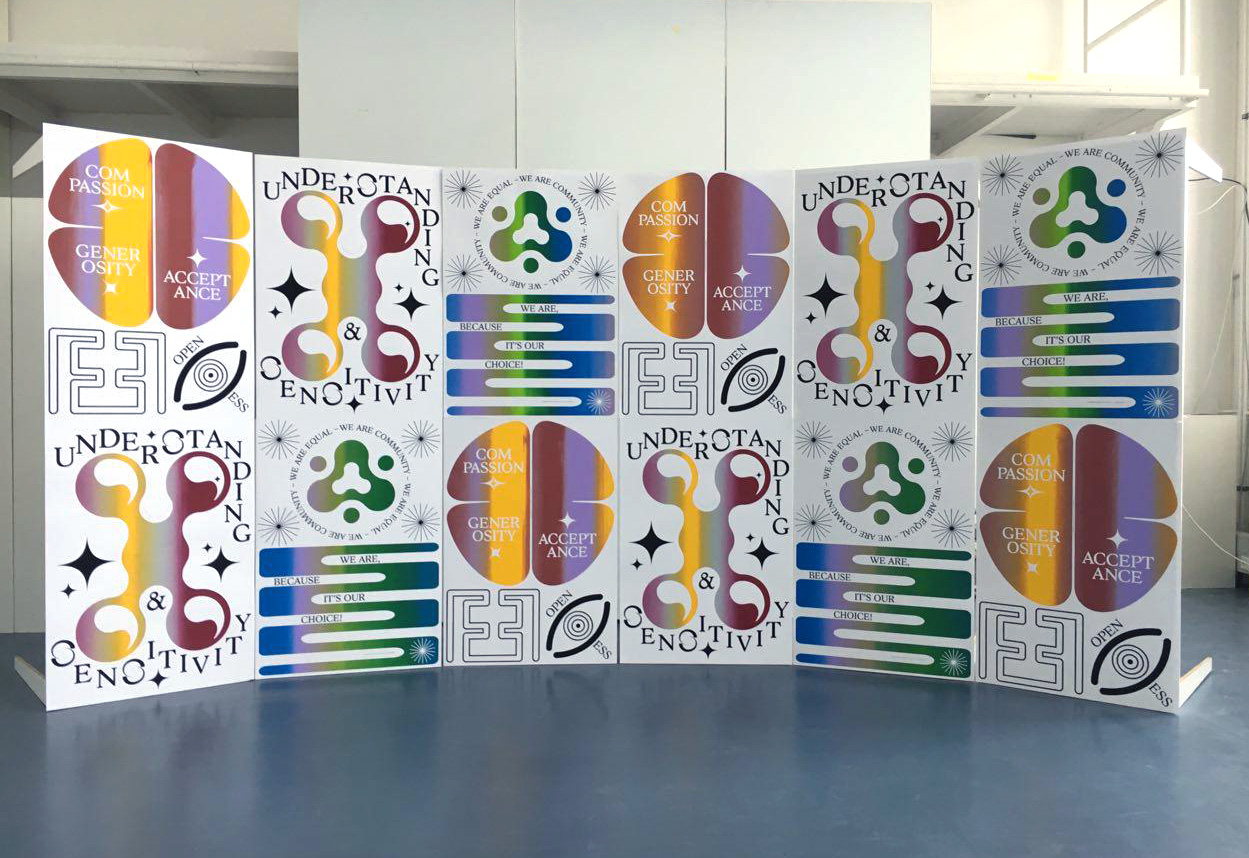
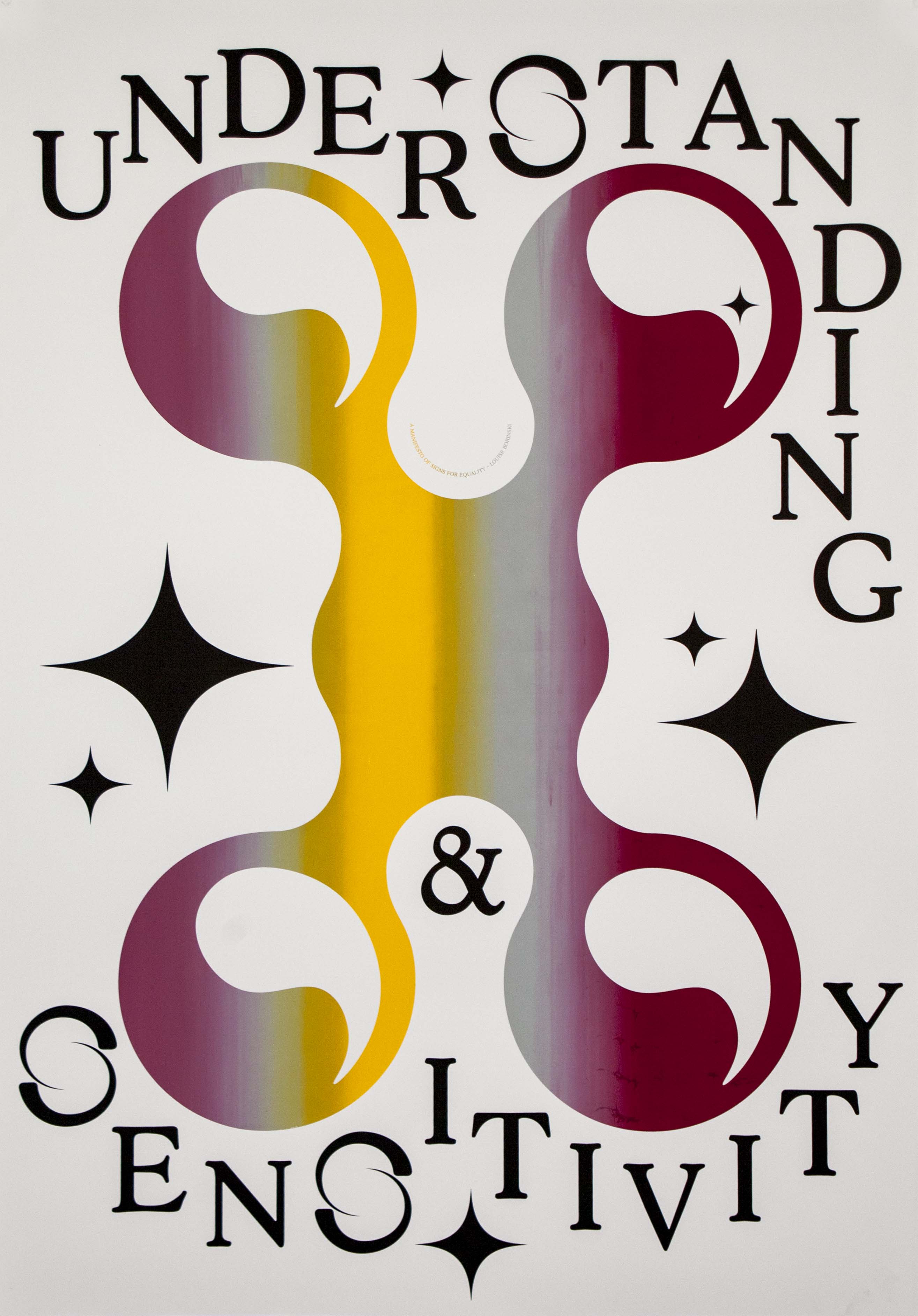
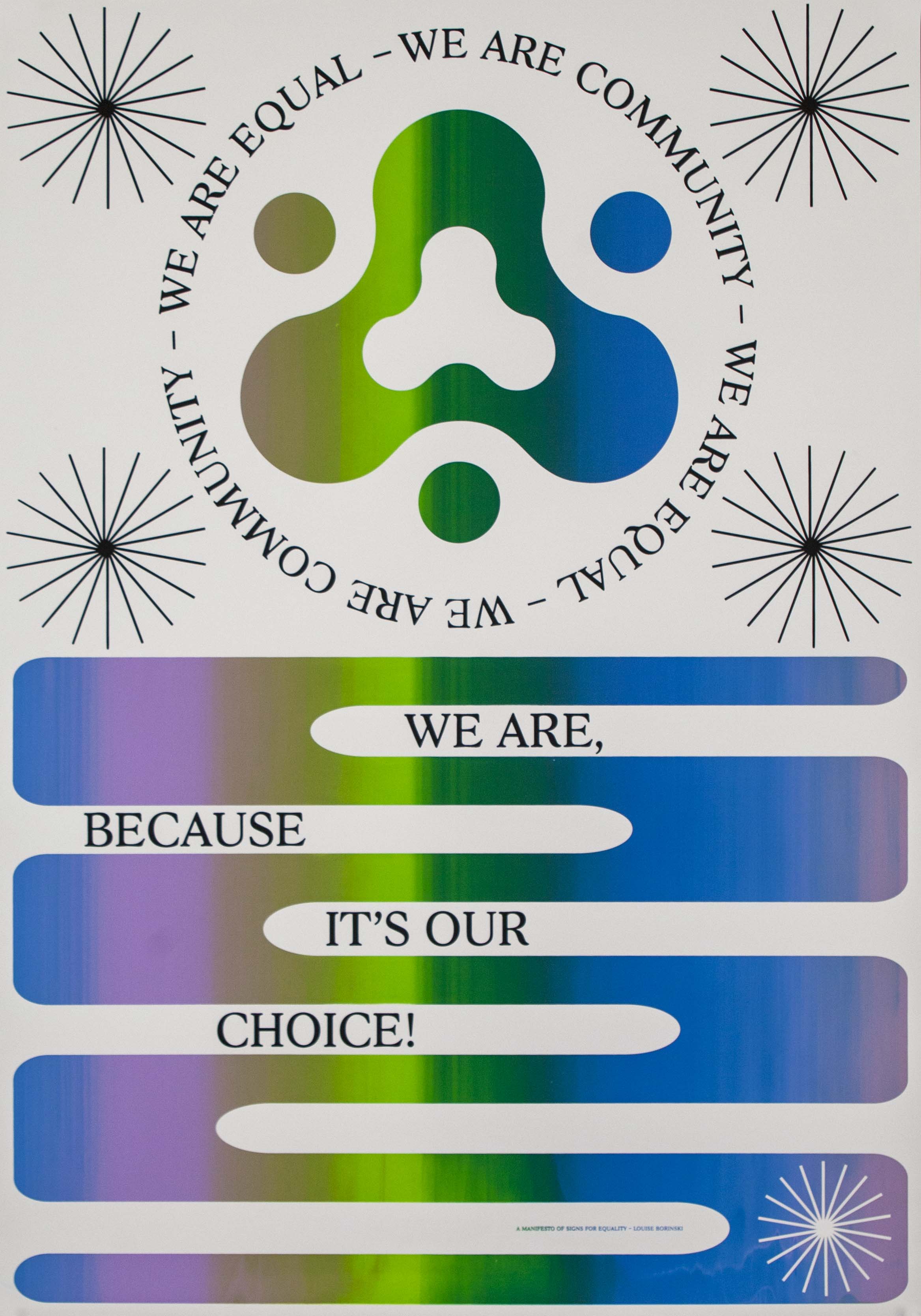
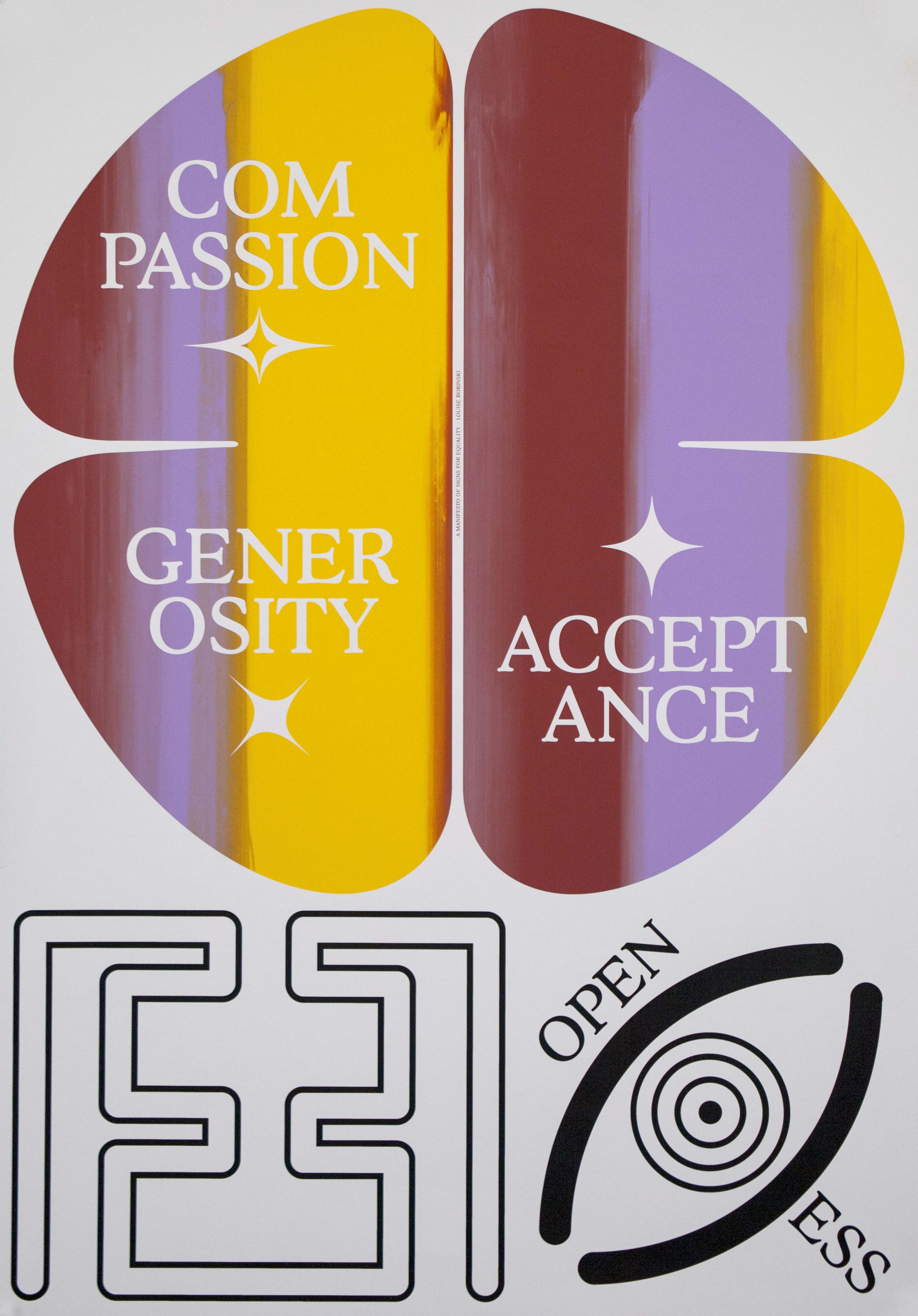
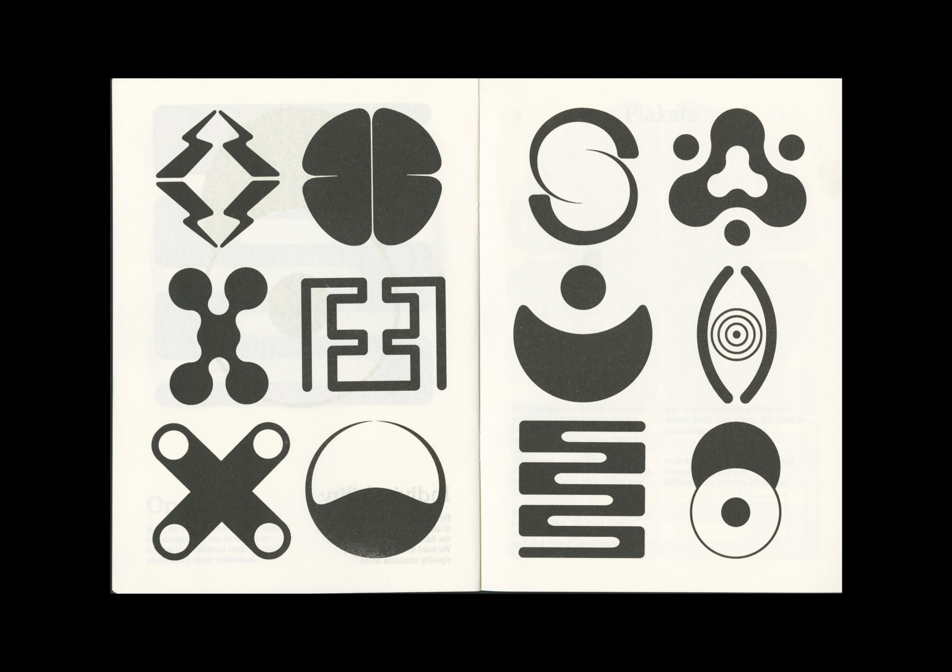
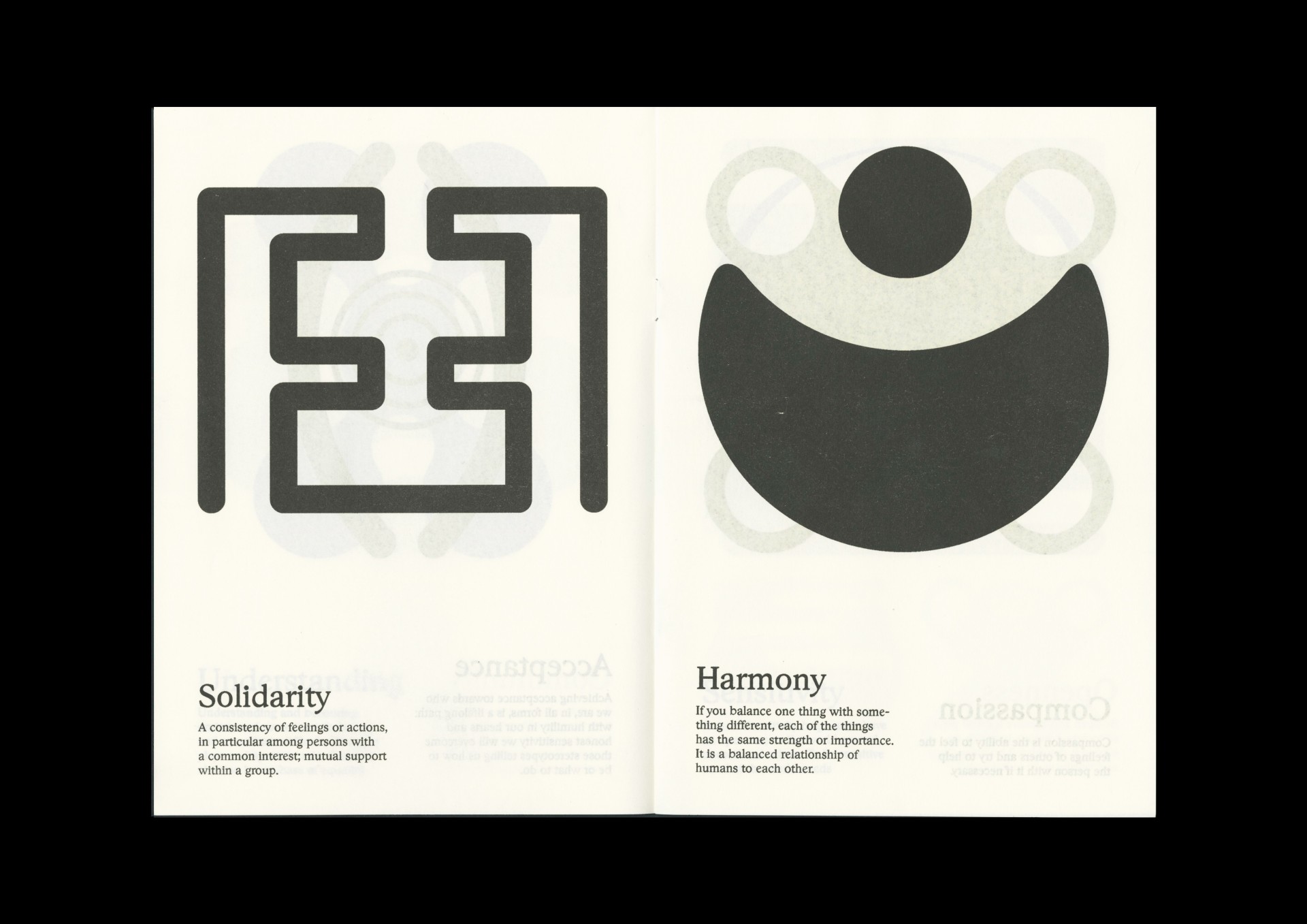
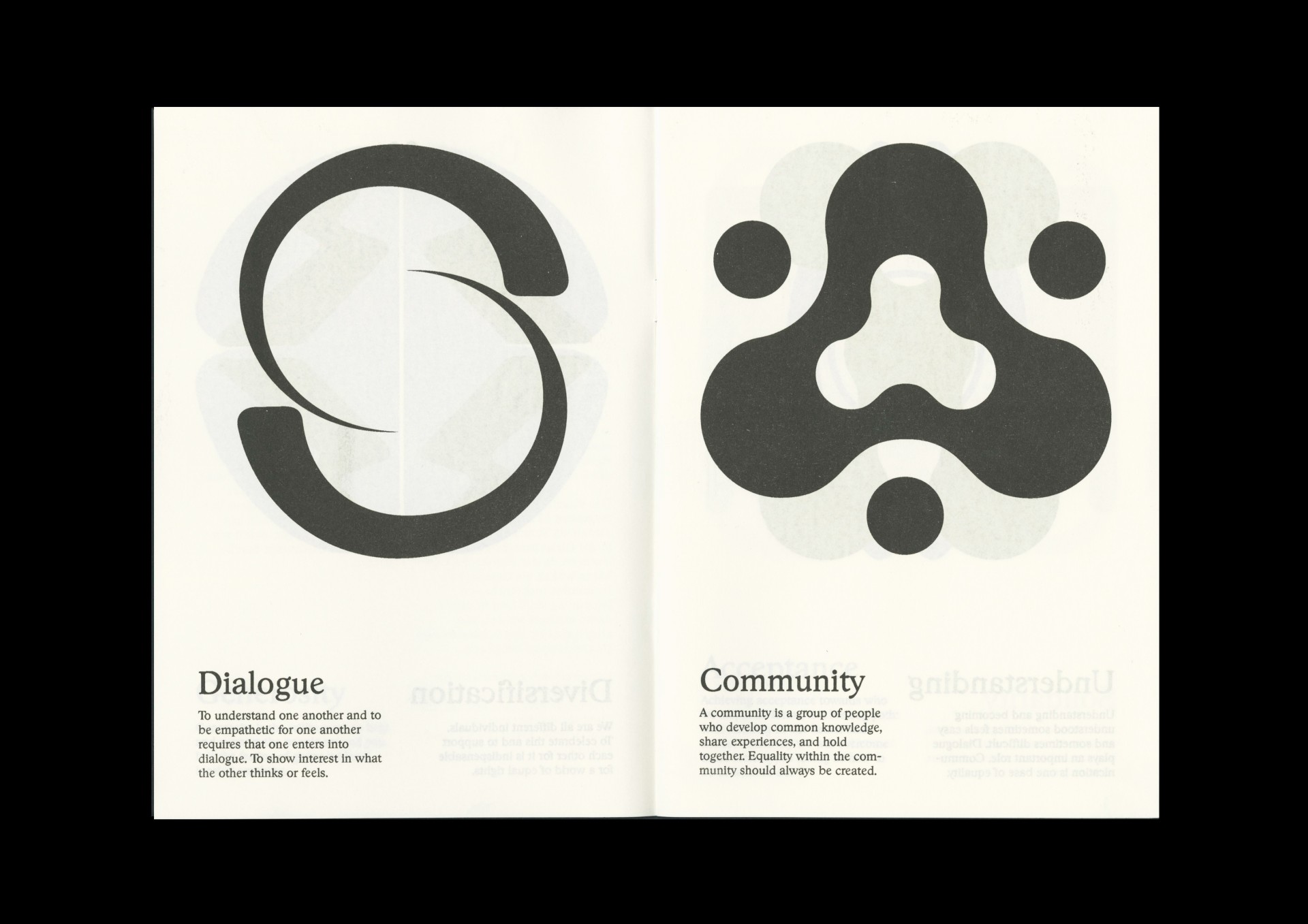
From the beginning my aim was to write a manifesto. The problem is that I’m not much of a writer. So I decided to create signs, because it’s something I know how to do, it’s my personal language. I put together twelve symbols which act as pillars for a life in a world of equality and harmony. I gave them literal meanings, but not in a way that I want to force the meanings onto someone. It’s about creating a new language closer to our intuitive self, one that relies less on words. Spoken language can be very limiting, especially regarding gender. It forces us to decide who we are, how in-between we are, and how to define ourselves.
Why did you choose working with the iris printing technique for these posters?
[LB] It was important to me to have them be colorful and genderless. Everyone can feel represented in that spectrum of colors. Iris printing is great, because no poster will look the same, the colors will always be distributed in a different way, you can’t plan it.
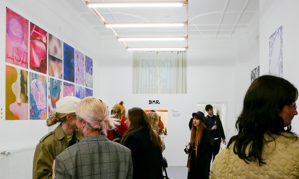
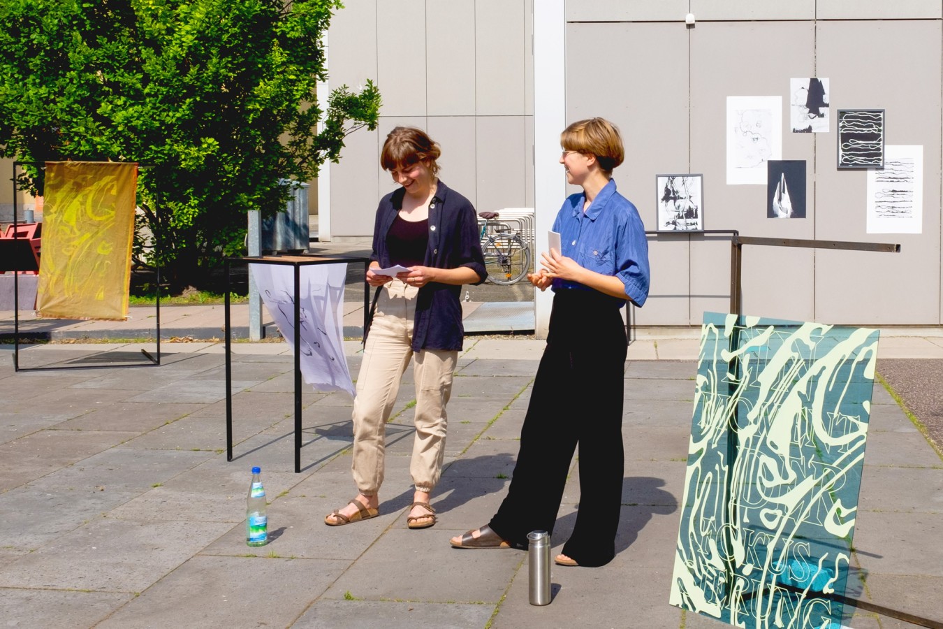
How was your project received amongst your peers? What could come next?
[LB] The feedback that I received from fellow students was very positive. It sparked discussion—also among our teachers—which is what I aimed for, so that was really nice. I’ll send the project to blogs, but also plan on using the signs for bigger installations or print flags, that would be a lot of fun ·